Using the EARS dashboard
Using the EARS dashboard
The EARS dashboard is a free tool that enables you to generate insights on religion and society based on the topics, countries, and timeframe of your interest. Our international team of analysts keeps the dashboard up-to-date with hundreds of new summaries each month. In this article, we will show you how you can adjust your search terms and in what way you can interpret the results on the dashboard.
Specifying your search
- First, select your preferred time frame. In the example below, we will look at all articles from the past month.
- Second, select the topics you are most interested in. For this example, we will be looking at tolerance, leadership, and ethics.
- Finally, you can select the countries you’d like to analyse. We will include all countries in this example.
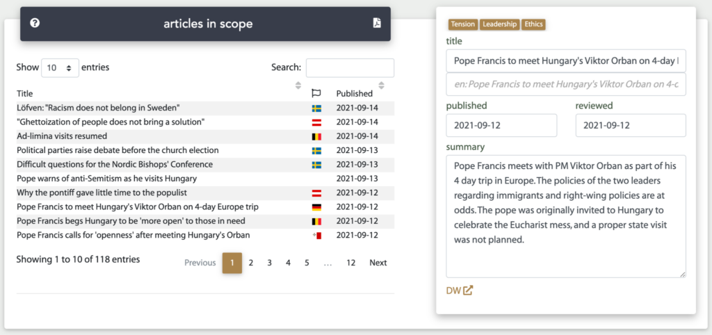
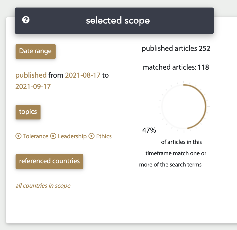
As can be seen in the image below, this combination of search criteria results in 118 articles. In other words, 118 articles have been added in the past month that touch upon the topics of tolerance, leadership, and/or ethics. If you would like to have a more detailed search, read this article to learn how to use advanced search options.

After entering your search terms, the dashboard will automatically generate a number of graphs and insights.
Articles in scope
To start with, the dashboard provides a complete list of article summaries that are included in your search scope. In our example, this means that a list of all 118 articles is provided. Click on an article from the list to display its title, publication date, and a summary of the article. This information is always in English. If you would like to read the original article, simply click the link at the bottom of this display.
In the graph shown below, you can view how your search scope relates to the complete database of articles in the dashboard. In our example, the 118 articles resulting from the search are 47% of all 252 article summaries added in the past month. In other words, 47% of all articles between August 17th and September 17th 2021, relate to one or more of the topics of tolerance, leadership, and ethics.
Trends over time
The graph below shows how often a specific topic is mentioned on the dashboard. Note that this is a percentage of the articles published on the dashboard, so not an exact representation of all articles in the European media.
This graph provides insights into the importance of a certain topic over the past year. For example, you can see that the topic of tolerance was linked to 50% of articles in October 2020, but to only 10% of articles in the dashboard in September 2021.
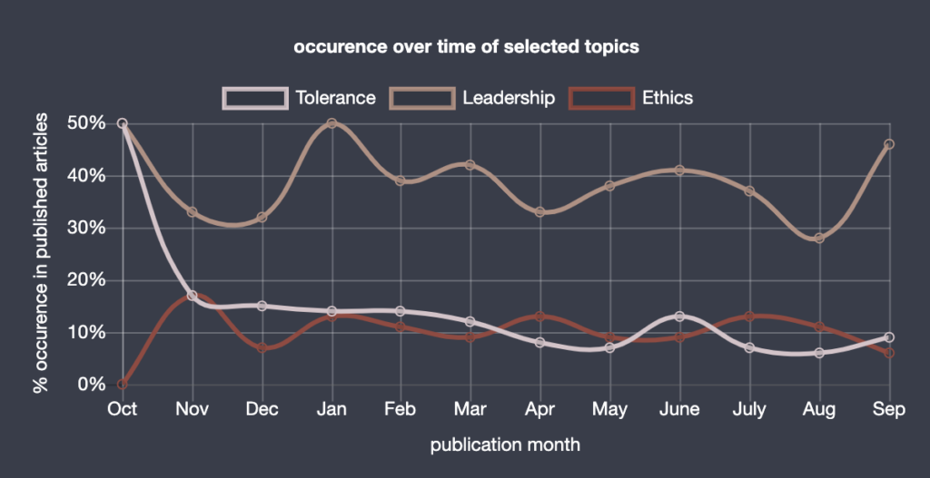
It can be especially interesting to see how certain topics may mirror or imitate each other’s development. This enables you to analyse how topics and trends may be related to each other.
Word cloud
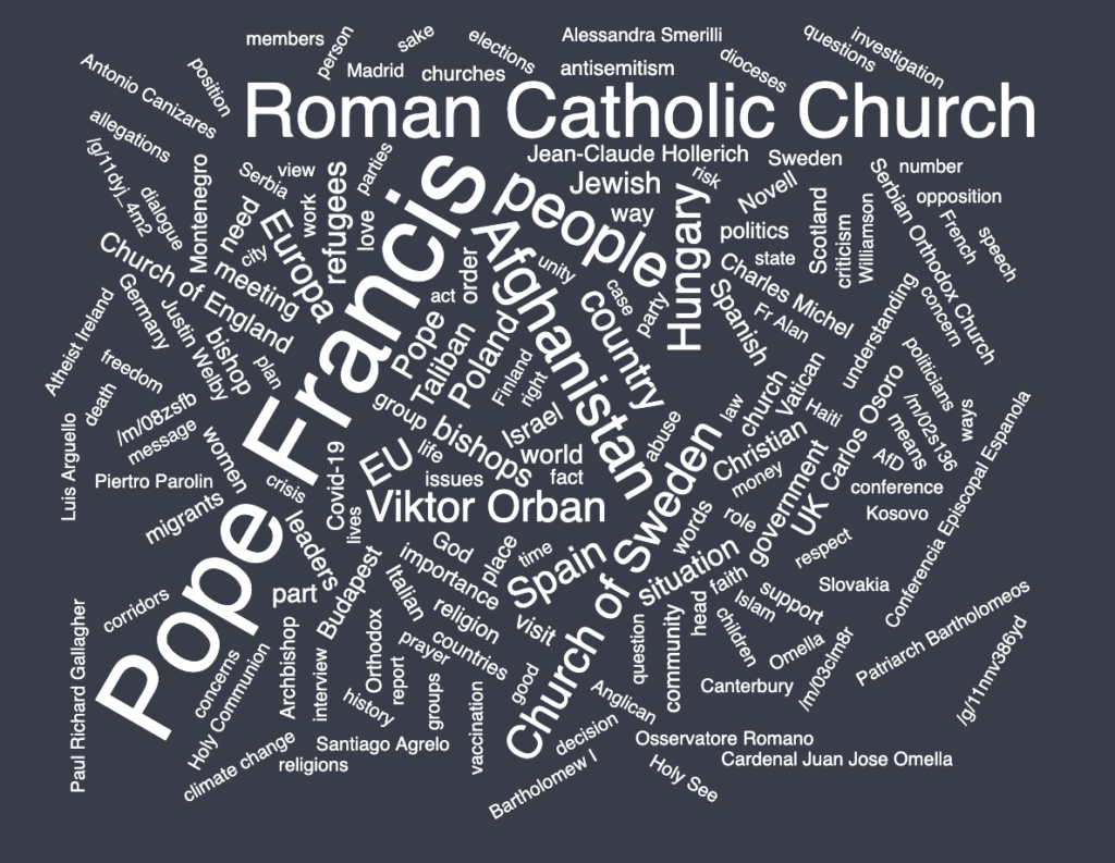
The word cloud generated on the dashboard provides an easy way to see which themes are most important within your selected timeframe, topics, and countries. In our example, focusing on the topics of tolerance, leadership, and ethics, we can see that the role of leaders such as Pope Francis and Viktor Orbán was significant. Another conclusion we can draw from this word cloud is how the three topics are especially relevant in Hungary, Afghanistan, and Poland at the moment.
Your topics are related
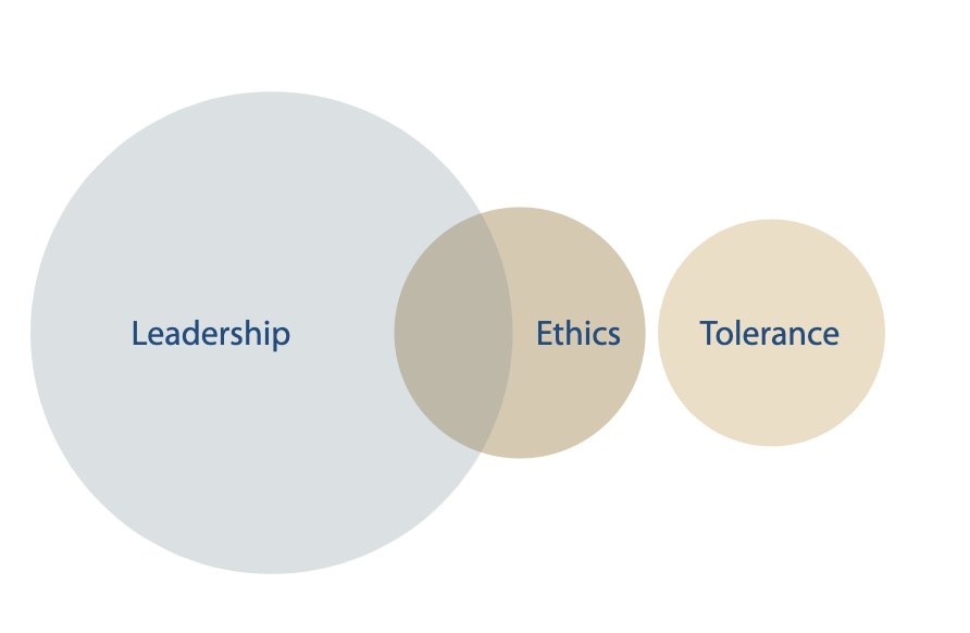
Some of our 118 articles might relate to one of our selected topics only, whereas others may be linked to two or even three of the topics. In the Venn diagram on the dashboard, you can see how the topics overlap. In our example, we can see that the majority of articles in our search scope relates to the topic of leadership. A small part of these articles considers not only leadership, but also ethics. Therefore, we can draw the conclusion that leadership and ethics are sometimes connected.
Since tolerance is a separate bubble in the diagram, none of the article summaries relates to both the topic of tolerance and either ethics or leadership. Note that articles about tolerance may, however, overlap with topics that are currently not included in the search scope.
Geographic distribution
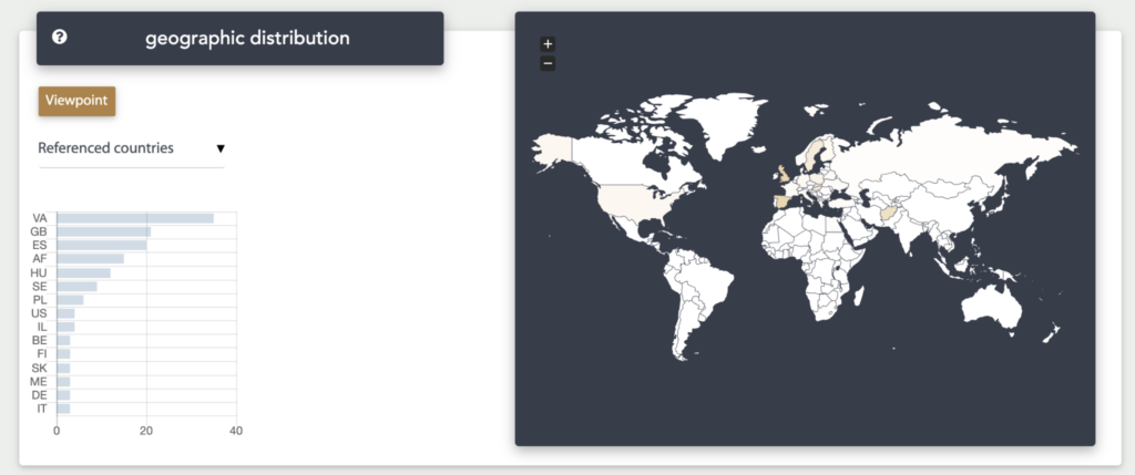
Our team of analysts keeps the dashboard up-to-date on a daily basis. They are located across Europe and keep track of the news in their own country. The world map on the dashboard shows that some issues play a more important role in one country than in the other. It signals both where an article was published and what country the article is about.
For example, see how a large part of our 118 summaries either originate from or discuss the Vatican. It is likely that the topic of leadership is closely related to the Vatican, since Pope Francis is situated there.
Sentiment
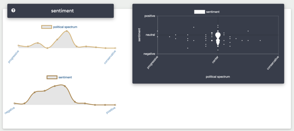
The final graph on the EARS dashboard shows how the article summaries on these topics are rated on the political spectrum (on a scale from progressive to conservative) and on sentiment (on a scale from negative to positive).
In the graphs below, it can be seen that the summaries in our example are mainly neutral when discussing the political spectrum, with a number being rather progressive as well. Regarding sentiment, the summaries in our search scope have an overwhelmingly negative tone.
Your turn on the EARS dashboard
The example above shows how you can use the EARS dashboard to generate new insights on the topic of religion. You are now all ready to use the dashboard yourself by comparing and analysing your preferred topics, countries, and timeframes.


